
Page speed is the pace at which a single page of your website takes to load. Different pages have varying speeds, depending on factors like images, script loading speed, website performance, server performance, which web page you’re on, the connection type, the internet service provider, processing power of the device, internet packages, browsers, what activity is taking place while the page loads, number of apps currently running on the user’s device, etc.
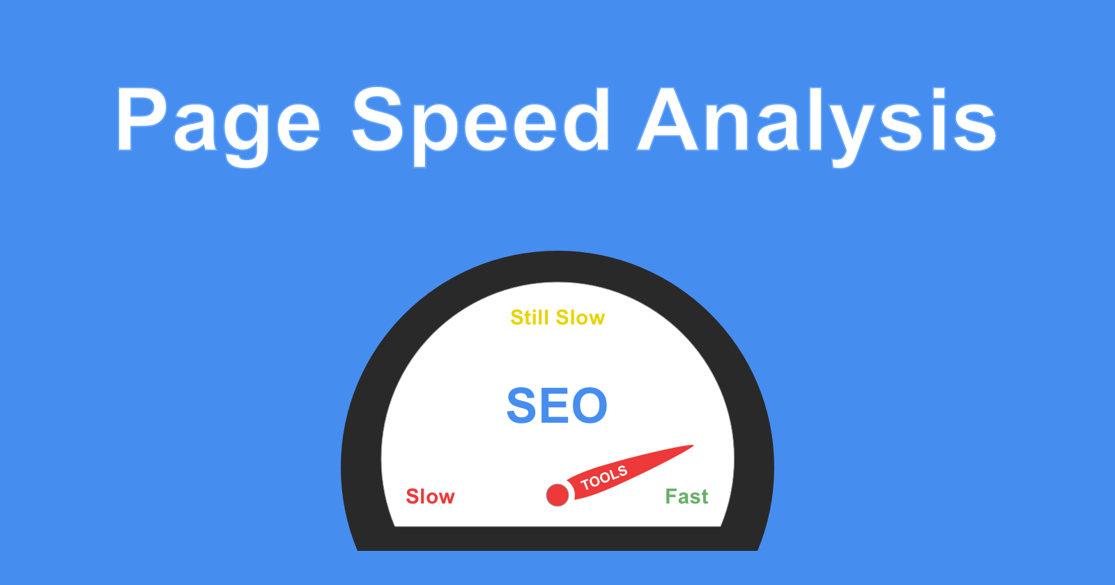
However, we only have control over our servers and our website, which we really need to take care of. And page speed isn’t a score, it’s more like a web page’s loading time measured in seconds.
How to improve your page-speed score?
- Server response time
- Image compression
- HTML & CSS structuring
- Minification & Script compression (making a file smaller by removing unnecessary information)
- Cache policy
- Lightweight themes and plugins
Accelerated Mobile Pages (AMP)
AMP is a project headed by Google and Twitter, which was created to improve the performance of web pages for all mobile devices. The high-end technology behind AMP allows lightweight pages to load faster for tablets and smartphones as a lot of people use mobile devices.
AMP uses a stripped-down version of HTML to increase the functionality and speed of the mobile web pages. It requires a very lightweight version of CSS that allows images to load only when the mobile page is scrolled to the location and AMP also supports limited JavaScript.
AMP can only be managed and maintained by the publishers and third parties. AMP pages served in Google search results use a tenth of the data as compared to standard pages and loads in less than a second.
Progressive Web Apps (PWA)
PWAs are web applications that are developed using many specific technologies and patterns that allow them to take the upper hand of the web as well as native app features. To easily access their favourite apps you can install the native apps to your device that will work offline while your user enjoys tapping their home screens and easily clicking through their liked apps rather than opening it through another browser. PWA and responsive designs allow you to create and build mobile-friendly apps.
In order for your app to be considered a Progressive Web App, it must be:
- Progressive – regardless of browser choice, enabled for every user
- Responsive – fit for: desktop, mobile, tablet, or whatever is next.
- Connective – enhanced service to work offline or on low-quality networks.
- App-like – have app-style interactions and navigation.
- Updated regularly – always refresh
- Safe – Served via HTTPS to ensure content has not been tampered with and prevent snooping.
- Discoverable – identifiable as “applications” due to W3C that allows search engines to find them.
- Re-engageable – through features such as push notifications.
- Installable – Allow users to “keep” apps on their home screen without an app store.
- Linkable – does not require complex installation and can be easily shared via URL